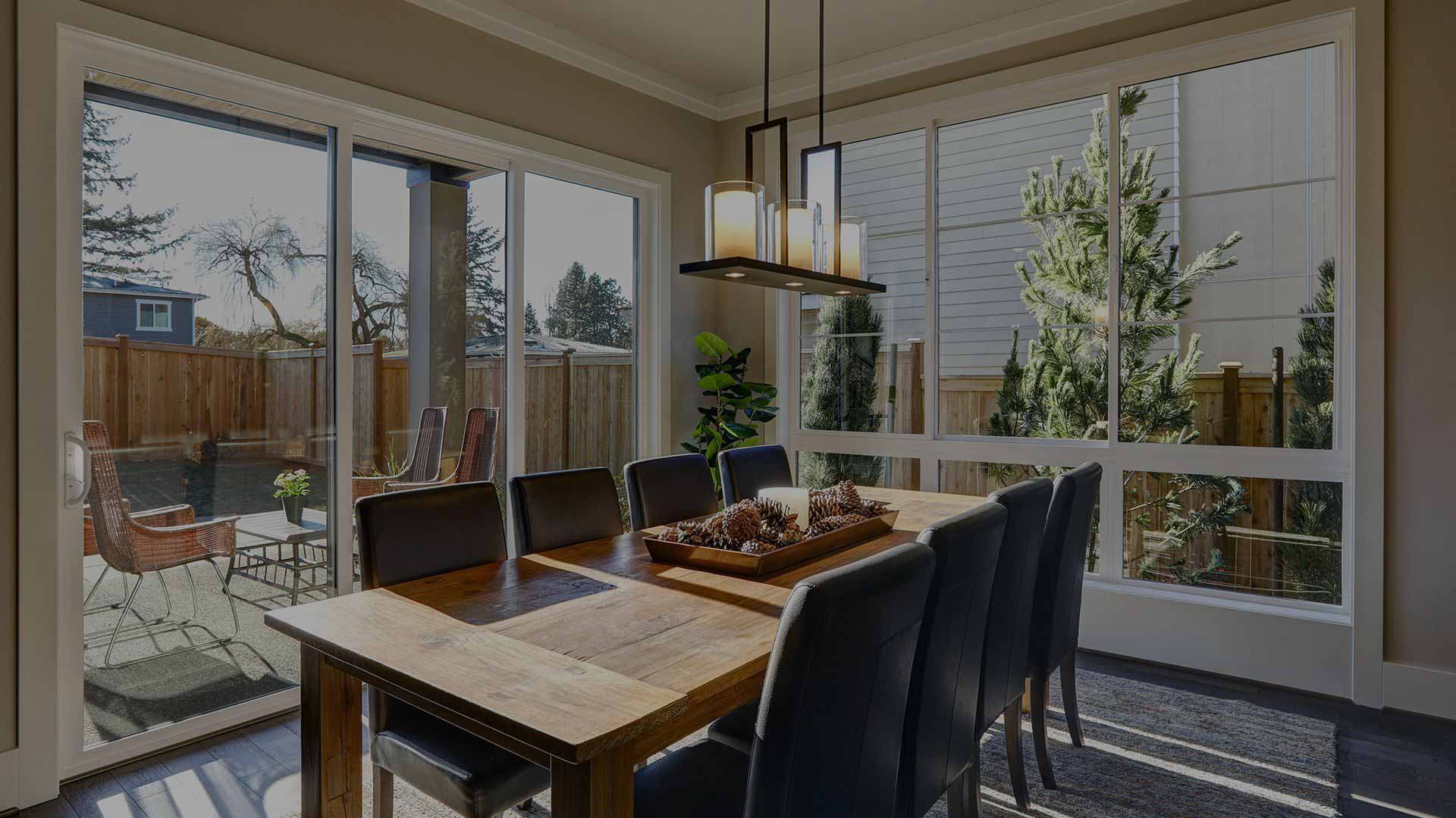
Working With Colors For Interior Painting

Are you getting stuck between all the hundreds of paint colors you could choose for your interior painting project? Hmm, decisions, decisions...
One easy way to choose paint colors for interior painting is to pick up the phone and ask a professional house painter. There are many tricks professionals use, but the advice you'll get differs. One of the easiest ways to choose paint colors for interior painting is to choose those that complement each other on the color wheel.
Choose Complementary Colors
Complementary paint colors are simple to choose for house painting. These colors are positioned directly across from each other on the color wheel.
The easiest way is to choose two or three complementary colors by starting with the first color. Pick the one that looks most pleasing to you for the project you have in mind and then use the color wheel to find the others.
Getting To Know How The Color Wheel Works
A color wheel may be the most useful tool you'll come across when choosing colors for an interior or exterior painting project. The following are a few things to understand about how the wheel works.
- The standard primary colors will always be red, blue, and yellow.
- Secondary colors are orange, green, and purple.
- Equal parts of the primary three colors will make the three secondary colors.
- Tertiary colors are the six colors above combined.
- White or black are added to mute or brighten a color (shade).
Warm & Cool Paint Colors and How They Go Together
Warm and cool colors that are complementary to each other go great together. If you'd rather not try colors out on the wall before you choose them, you can use two of the complementary colors as accents for trim work or an accent wall.
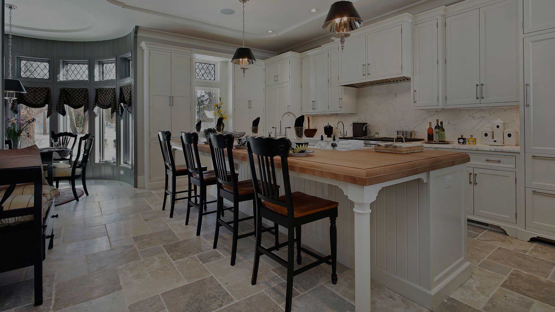
In a 1950's kitchen, a warm yellow window trim next to a cool, violet countertop would go nicely with painted beadboard walls and white painted cabinets. Cabinet painting is a great way to use a neutral color your walls may wind up missing.
Primary Red & Green Paint, Where and When It Can Look Nice
Primary red and green paint is mostly used for holiday decorating, but it can work nicely for wall painting if you use the right shade. The shade of color makes a big difference!
In a rustic kitchen, a muted or shaded primary-green paint that's brushed onto the walls and lower cabinets look fantastic with darker painted cabinets and flooring, so consider a mahogany paint for cabinet painting and beautiful, dark flooring.
Brighter complementary paint colors give new life to an interior space. When using more saturated colors, be careful because they often look more intense on the walls than they did on the paint swatch.
If your interior painting is complete and you're missing something, you can also decorate with small colored accessories in the colors of your choice.